
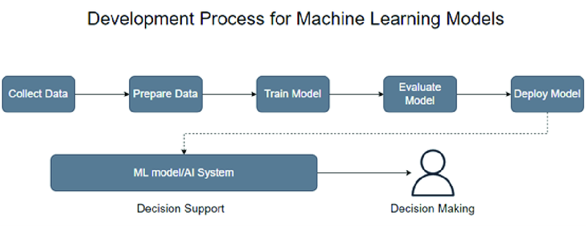
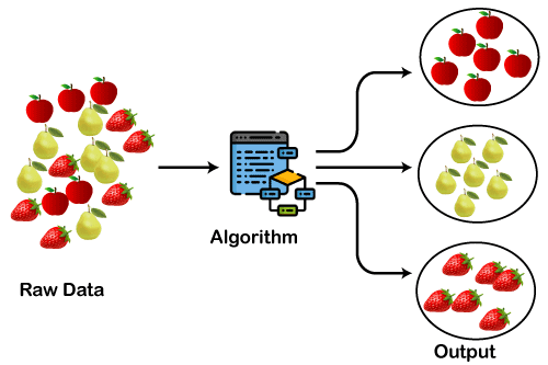
Data Science is a multidisciplinary field that leverages statistics, programming, machine learning, and domain knowledge to extract insights from data. This comprehensive guide covers key concepts including model selection, model building, model validation, regression and classification techniques, ensemble learning, accuracy metrics, confusion matrix, clustering, associative analysis, and generative analysis.
Model Selection
Model selection is the process of choosing the most appropriate machine learning model for a specific problem. Here are the key steps condensed into five points:
1. Understand the Problem: Clearly define the problem you're solving and determine the type of task (classification, regression, clustering, etc.).
2. Explore Model Options: Familiarize yourself with various machine learning algorithms suitable for your problem, considering factors like data size, complexity, and distribution.
3. Evaluate Performance: Train multiple models and evaluate their performance using appropriate metrics, such as accuracy, precision, recall, etc., depending on your problem type.
4. Consider Model Complexity: Balance the trade-off between model complexity and interpretability, opting for simpler models if interpretability is crucial or if you have limited data.
5. Iterate and Optimize: Fine-tune your chosen model's hyperparameters, consider ensemble methods for performance enhancement, and continuously refine your approach based on experimentation and feedback.
Model Building
Model building involves selecting and training a machine learning model using a dataset to learn patterns and relationships within the data. The typical steps include:
1. Preprocessing the Data: Cleaning and transforming data to ensure it is in a suitable format.
2. Selecting an Appropriate Algorithm: Choosing the machine learning algorithm that best fits the problem.
3. Splitting the Data: Dividing the data into training and validation sets.
4. Training the Model: Using the training set to teach the model.
5. Evaluating Performance: Assessing the model's performance on the validation set.
Model Validation
Model validation assesses how well a model can produce accurate predictions or outputs. It's essential to validate models before deployment to ensure they are reliable. Techniques include cross-validation, holdout validation, and bootstrapping.
Regression Models
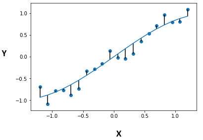
1. Linear Regression: Predicts a continuous output based on one or more input features.

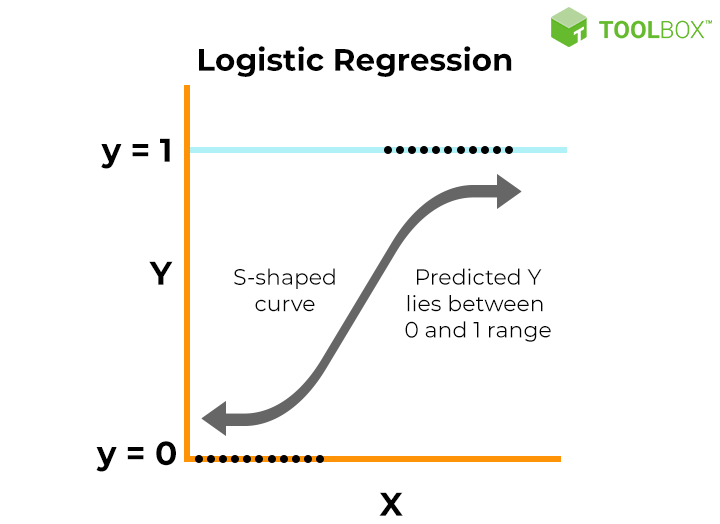
2. Logistic Regression: Performs binary classification by predicting the probability of an outcome.
3. Mean Squared Error (MSE): Measures the average squared difference between actual and predicted values.

Different Regression Techniques
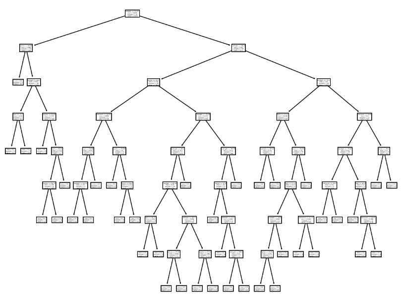
1. Decision Tree Regression: Partitions data into subsets and predicts the average target variable for each subset.
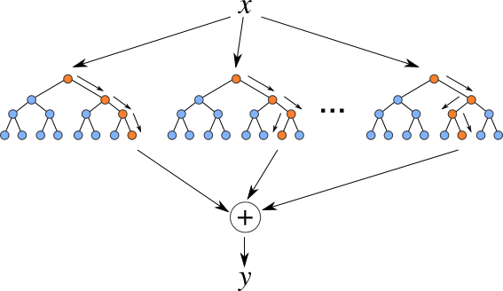
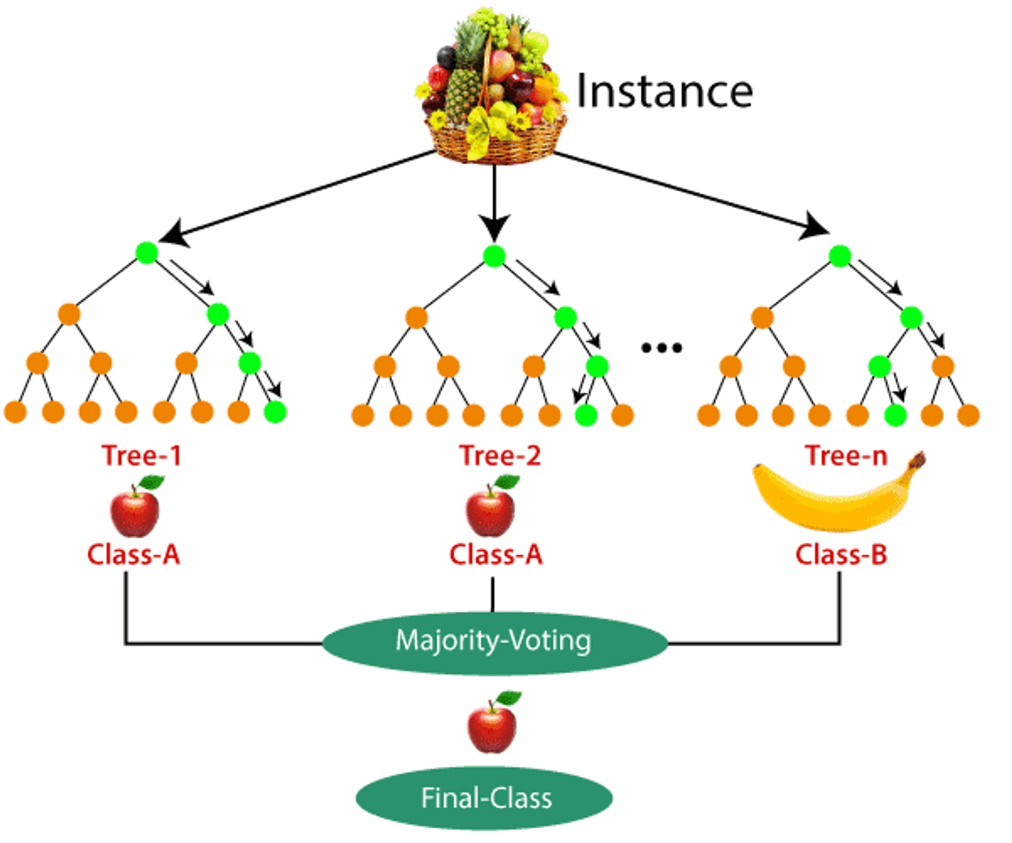
2. Random Forest: An ensemble method creating multiple decision trees and averaging their predictions.
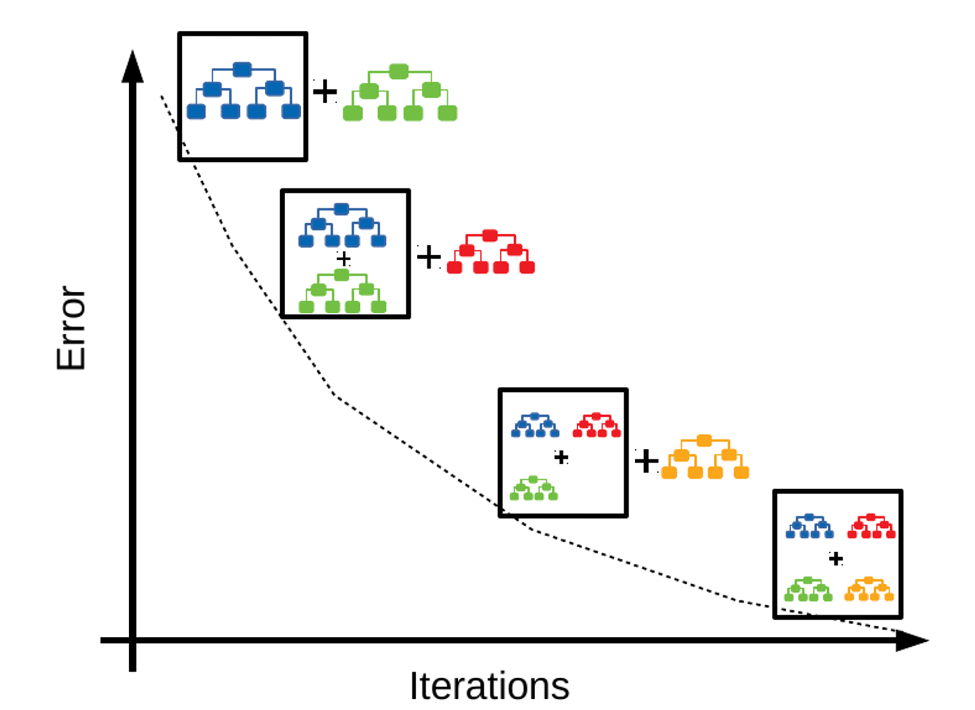
3. Gradient Boosting: Sequentially builds decision trees, each correcting the errors of its predecessor.

4. Residual Analysis: Evaluates the validity of a linear regression model by examining residuals (differences between observed and predicted values).
Classification Techniques
1. Decision Tree Classifier: Splits data into subsets based on input feature values to assign class labels.

2. Random Forest Classifier: Uses multiple decision trees and averages their predictions for classification.
3. Gradient Boosting Classifier: Builds a strong predictive model by combining multiple weak learners sequentially.
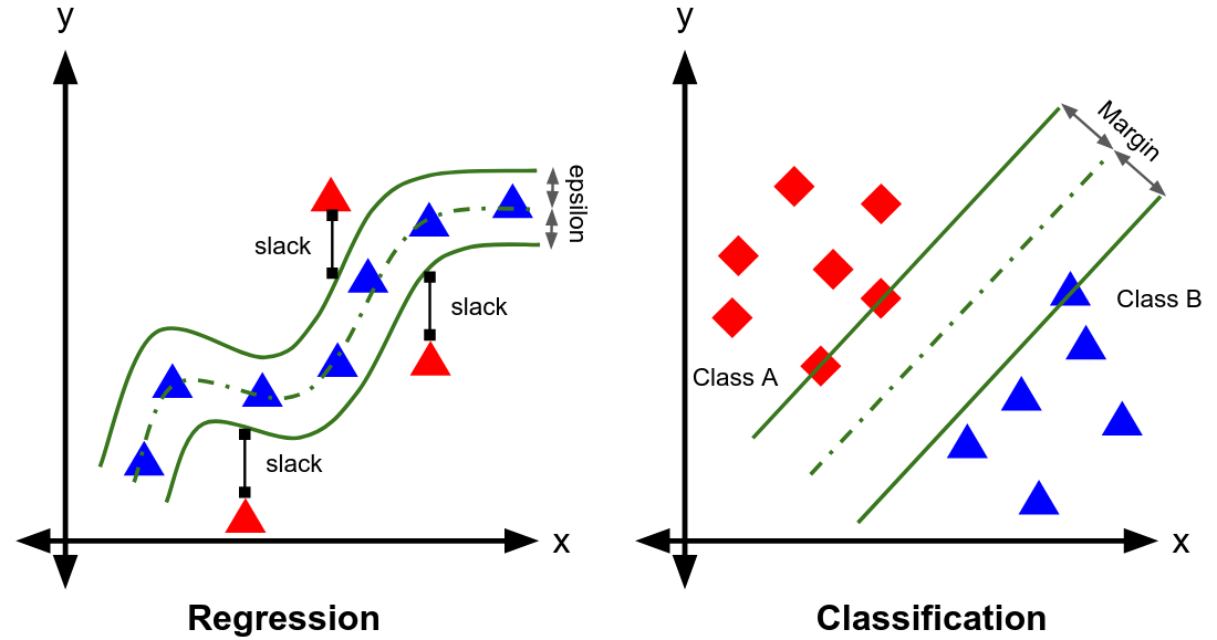
4. Support Vector Machines (SVM): Finds the hyperplane that best separates data points of different classes.
· Regression: Fits the data while maintaining a maximum margin.
· Classification: Separates data points of different classes in the feature space.
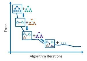
Ensemble Learning
Ensemble learning combines predictions from multiple models to improve overall performance and generalization. Methods include bagging (e.g., Random Forest) and boosting (e.g., Gradient Boosting).
Gradient Boosting
Builds multiple decision trees sequentially, each correcting the errors of its predecessor.
Accuracy
Accuracy is the ratio of the number of correct predictions to the total number of input samples.

Note: Accuracy works well only if there are equal numbers of samples belonging to each class.
Confusion Matrix
The confusion matrix gives a matrix output and describes the complete performance of the model.
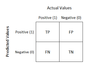
True Positives (TP): Predicted YES and the actual output was YES.
True Negatives (TN): Predicted NO and the actual output was NO.
False Positives (FP): Predicted YES and the actual output was NO.
False Negatives (FN): Predicted NO and the actual output was YES.
Precision
Precision is the number of correct positive results divided by the number of positive results predicted by the classifier.
Precision emphasizes minimizing false positives.
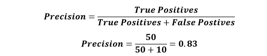
Use case example: Medical tests, where false positives (Predicted Diseased but actually healthy) can lead to unnecessary treatments.
Recall
Recall is the ratio of correctly predicted positive instances to the total actual positive instances. Recall focuses on minimizing false negatives.
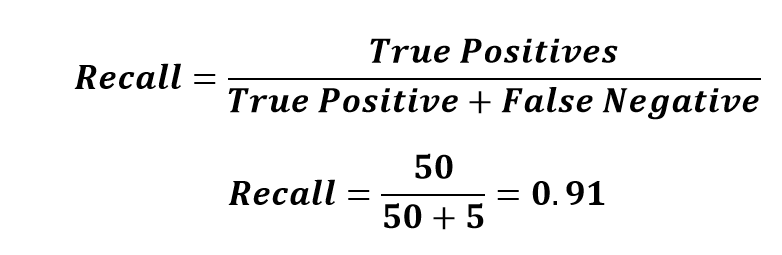
Use case example: Disease detection, where False Negative (predicted healthy but actually diseased) can have serious consequences.
Confusion Matrix Example
Suppose you trained a model to classify cancer patients. To evaluate the model performance, you must answer the following questions: Accuracy? Precision? Recall?
What should be of more concern: Accuracy, Precision, or Recall?

Clustering Models
Clustering models group similar data points based on their characteristics. Clustering is an unsupervised learning technique where categories are not predefined. Examples include:
1. K-Means Clustering: Partitions data into k clusters based on feature similarity.
2. Hierarchical Clustering: Builds a hierarchy of clusters through agglomerative or divisive methods.
3. DBSCAN (Density-Based Spatial Clustering of Applications with Noise): Identifies clusters based on density and can handle noise.
Associative Analysis
Associative analysis identifies and analyzes relationships or associations between variables within a dataset. It uncovers patterns, correlations, or dependencies that may not be immediately apparent.
Generative Analysis
Generative analysis involves generating new data samples similar to an existing dataset. A common approach is Generative Adversarial Networks (GANs), consisting of two neural networks:
1. Generator: Creates new data samples.
2. Discriminator: Evaluates the authenticity of the generated samples.
Data Visualization Charts in Data Science Processes
Data visualization is a crucial aspect of data science, as it helps in understanding complex data through graphical representation. Here are some common data visualization charts used in data science:
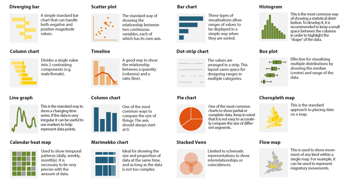
1. Bar Chart
Description: Displays categorical data with rectangular bars representing the frequency or value of each category.
Use Case: Comparing different categories or tracking changes over time.
2. Line Chart
Description: Plots data points connected by straight lines to show trends over time.
Use Case: Tracking changes in data over continuous periods, such as monthly sales figures.
3. Pie Chart
Description: Circular chart divided into slices to illustrate numerical proportions.
Use Case: Showing the relative proportions of different categories within a whole.
4. Histogram
Description: Similar to a bar chart but used for continuous data divided into bins.
Use Case: Displaying the distribution of a dataset, such as the frequency of different age groups in a population.
5. Scatter Plot
Description: Uses Cartesian coordinates to display values for typically two variables for a set of data.
Use Case: Identifying correlations or relationships between two variables.
6. Box Plot (Box-and-Whisker Plot)
Description: Summarizes a dataset’s distribution through its quartiles, highlighting the median, upper and lower quartiles, and potential outliers.
Use Case: Comparing distributions between different groups or datasets.
7. Heatmap
Description: Represents data through variations in coloring, with colors representing different values.
Use Case: Showing the magnitude of phenomena, such as correlation matrices or frequency of events.
8. Area Chart
Description: Similar to a line chart, but the area below the line is filled with color.
Use Case: Showing the magnitude of change over time, emphasizing the total value across a trend.
9. Bubble Chart
Description: Extension of a scatter plot where each point is represented by a bubble, with the size of the bubble indicating an additional variable.
Use Case: Displaying three dimensions of data in a two-dimensional plot.
10. Violin Plot
Description: Combines aspects of box plots and kernel density plots to show data distribution and density.
Use Case: Comparing distributions between multiple groups, especially useful for multimodal data.
11. Pair Plot
Description: Creates a matrix of scatter plots for multiple numerical variables.
Use Case: Exploring relationships between multiple variables in a dataset.
12. Treemap
Description: Displays hierarchical data as nested rectangles, with the size of each rectangle proportional to its value.
Use Case: Visualizing the proportion of subcategories within a category.
13. Radar Chart (Spider Chart)
Description: Displays multivariate data in the form of a two-dimensional chart of three or more quantitative variables represented on axes starting from the same point.
Use Case: Comparing multiple variables for different categories.
14. Waterfall Chart
Description: A variation of a bar chart showing the cumulative effect of sequentially introduced positive or negative values.
Use Case: Visualizing the cumulative effect of sequential data, such as profit and loss over time.
15. Gantt Chart
Description: Represents a project schedule showing tasks or activities displayed against time.
Use Case: Project management to illustrate the start and finish dates of the elements of a project.
16. Sunburst Chart
Description: Visualizes hierarchical data using concentric circles.
Use Case: Displaying data with multiple levels of categories.
This guide provides a comprehensive overview of essential Data Science concepts. By understanding and applying these principles, you can effectively prepare, model, and analyze data to derive meaningful insights and make informed decisions. Also these charts help in effectively communicating insights derived from data, aiding in decision-making processes.
Comments
Post a Comment